Uncle Toby's Logo Redesign/Style Guide
Identity Systems | Logo Redesign & Style Guide University of Canberra's Identity system unit focused on the rebranding and the redesigning of an Australian food product, Uncle Toby’s was chosen for this assessment. The work included the development of a corporate style manual so the client would have an organisational style guide for future branding products. Research was required to appreciate company ethos as well as an understanding of the latest graphic branding developments within the food industry. The new logo kept the iconic Uncle Toby’s ‘O’ to show historical significance and how far the name has come, whilst continuing to always look modern and stand out amongst other food brand.
You may also like
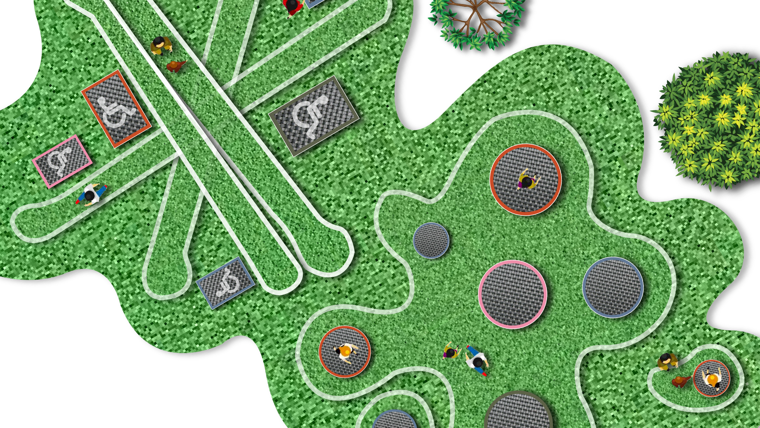
Intergenerational Play Area Project
2020

Communication Posters
2022

5 Tarot Card Designs
2019
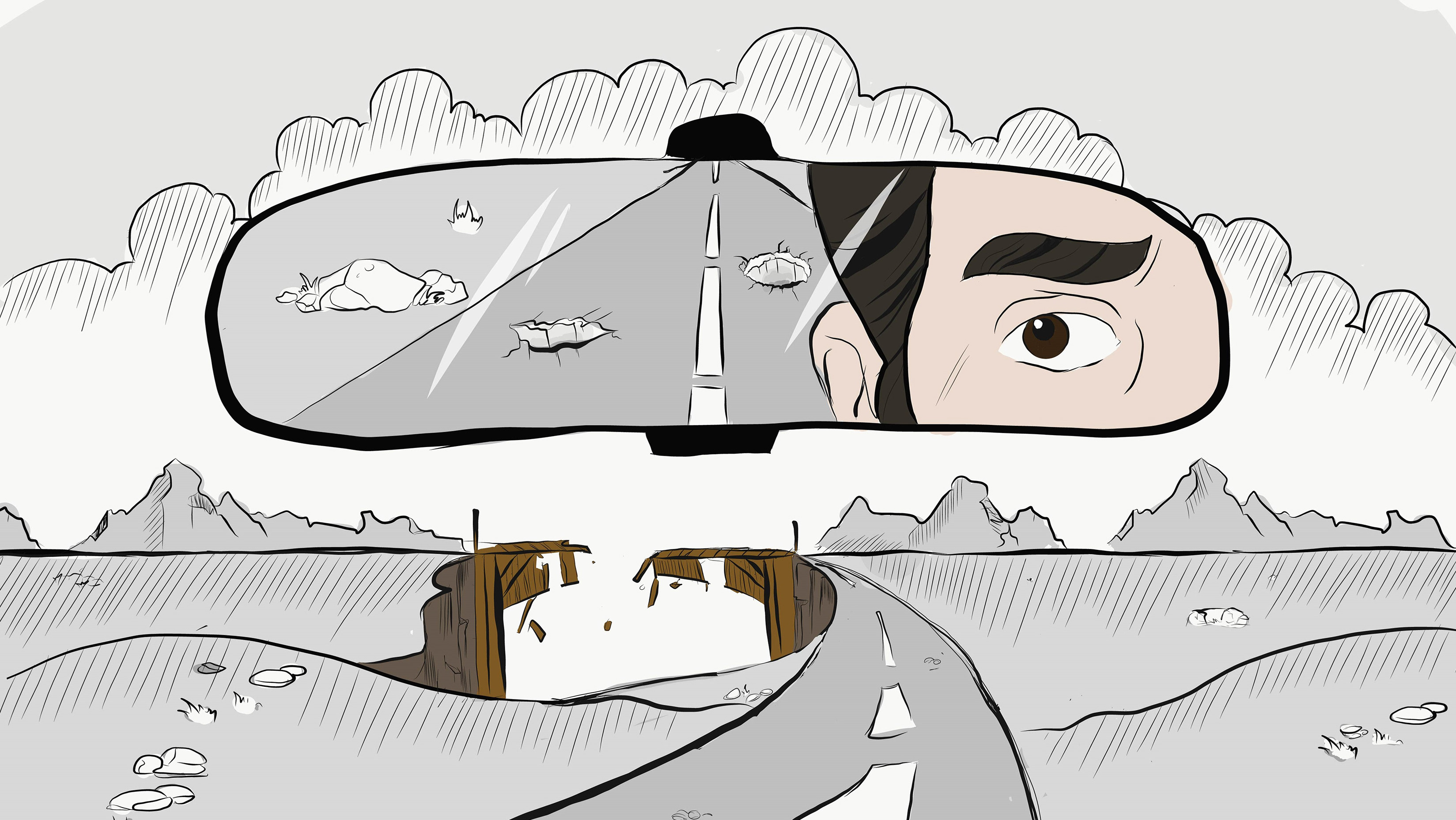
Illustrations for projects (MISC)
2022

"Dancing Plants" Motion Graphics
2018
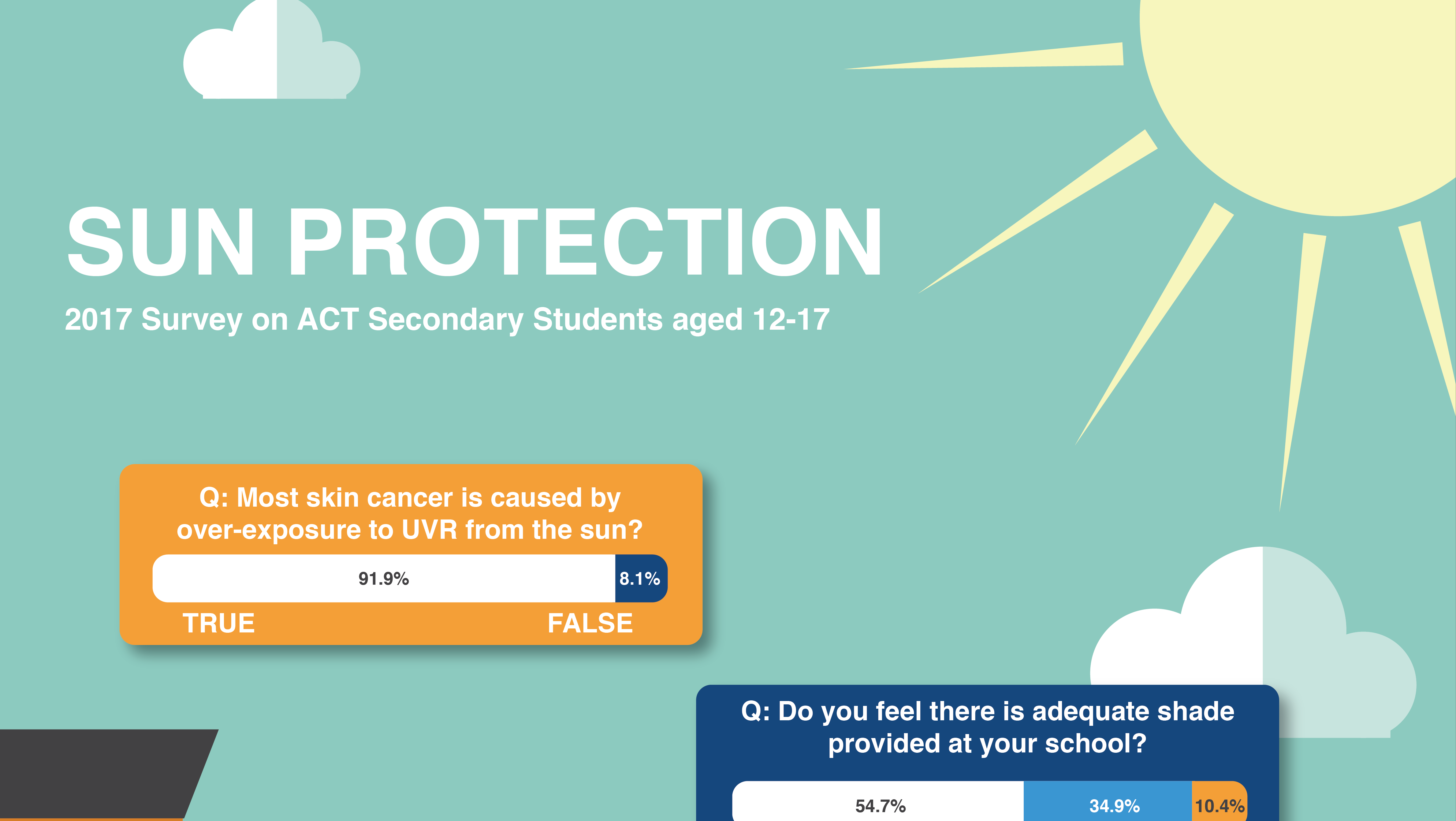
Sun Protection Infographic
2019
"Interrogating Gingy" Motion Graphics
2018
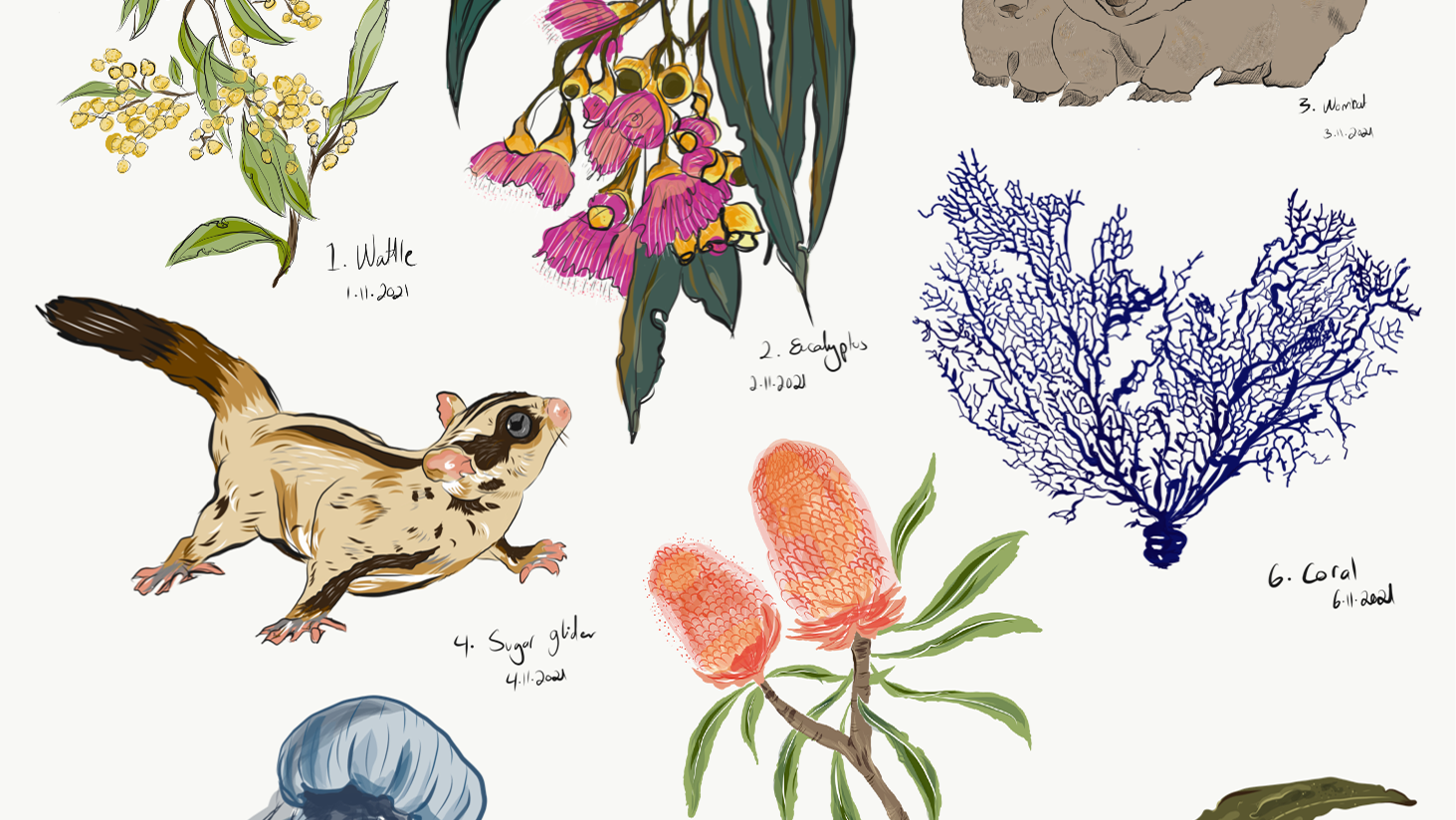
November Challenge
2022
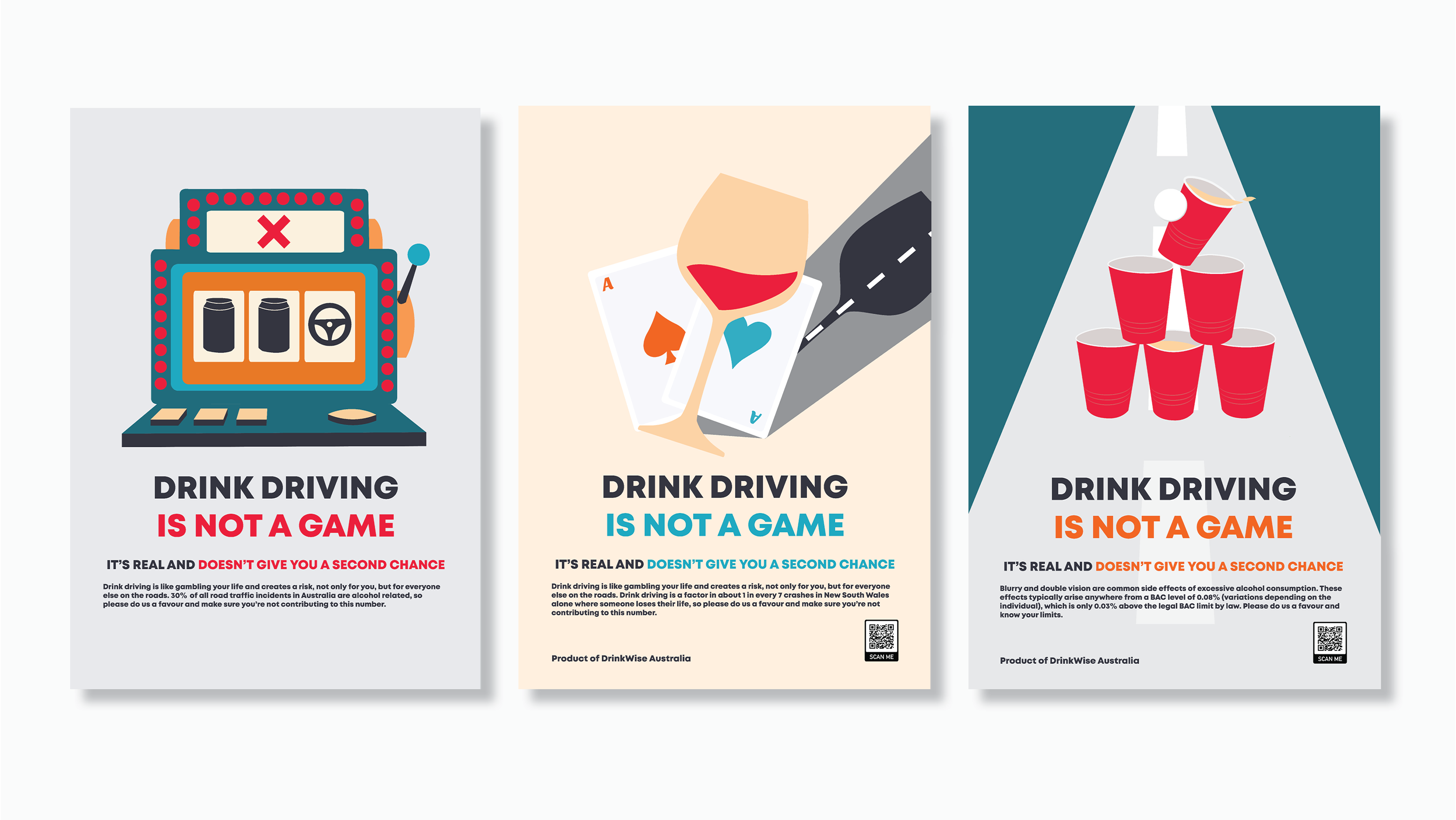
Anti-Drink Driving Social Marketing Campaign
2020

Brand Relaunch (Signage and Stationary)
2021
